Succulence Quilt

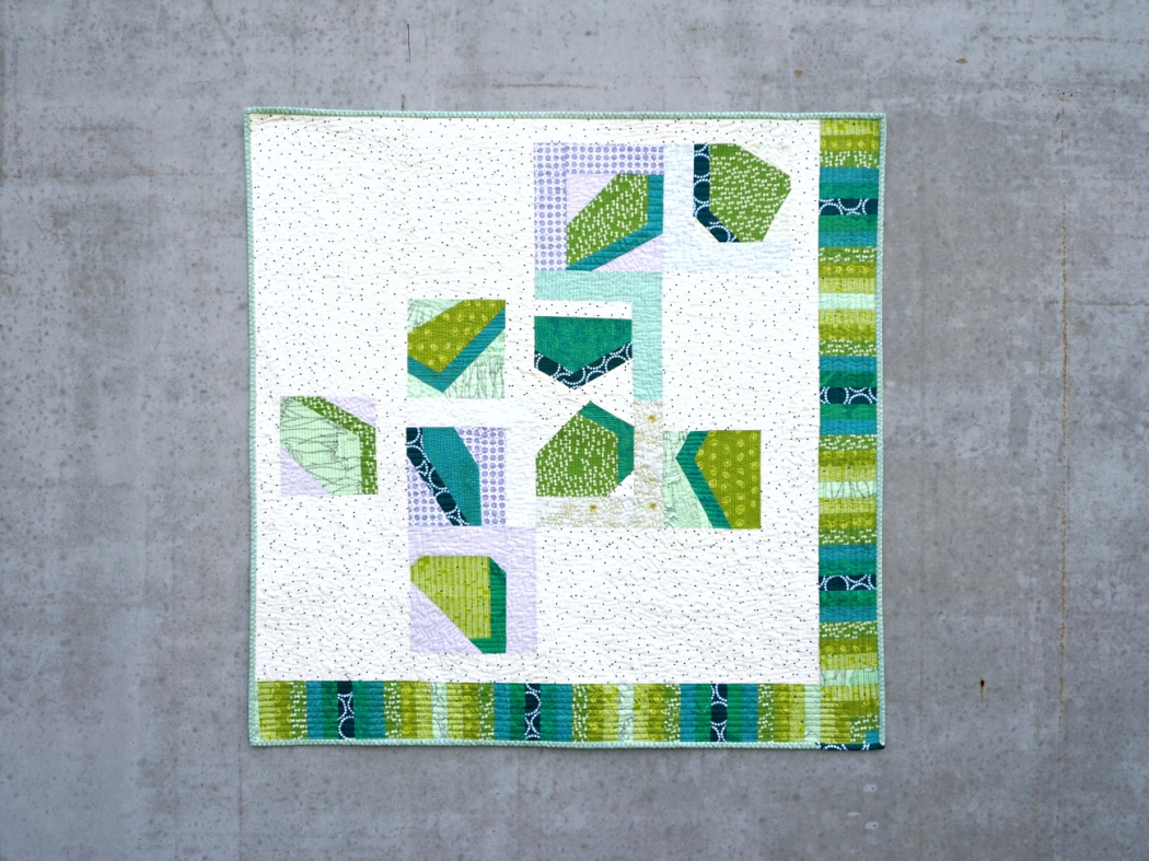
The Succulence Quilt is my entry into the Pantone Quilt Challenge 2017. It measures 42” x 42” so it goes into the ‘Big Quilt’ category.

Succulence Quilt | veni vidi vicky

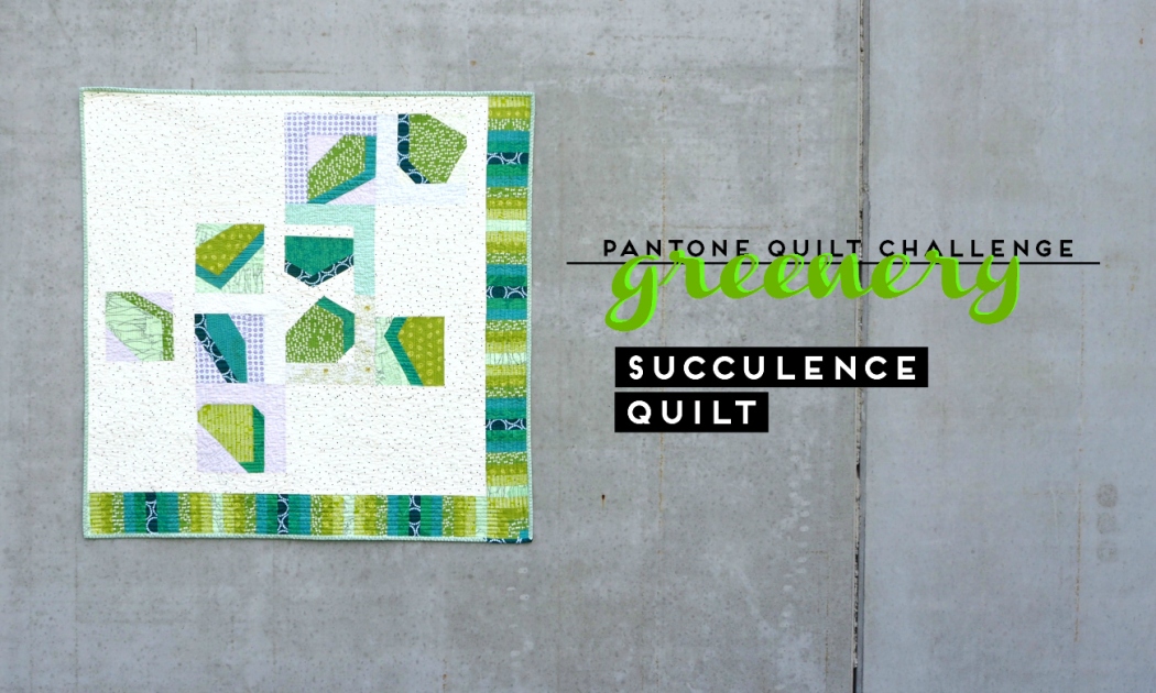
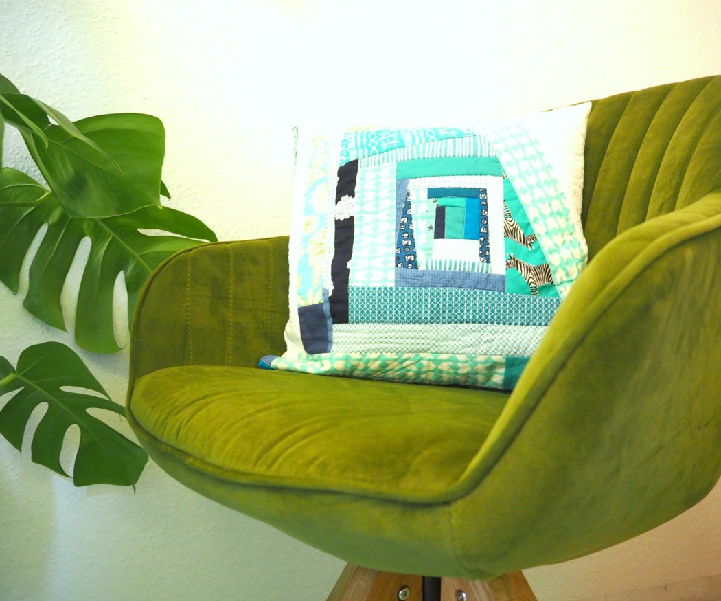
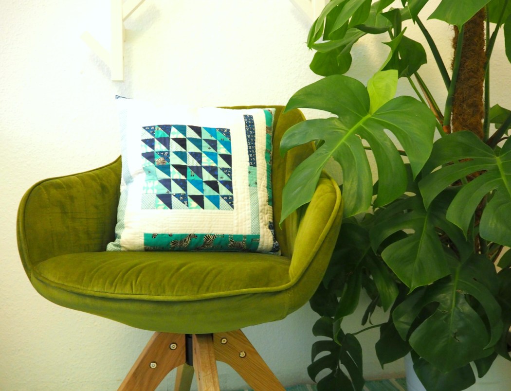
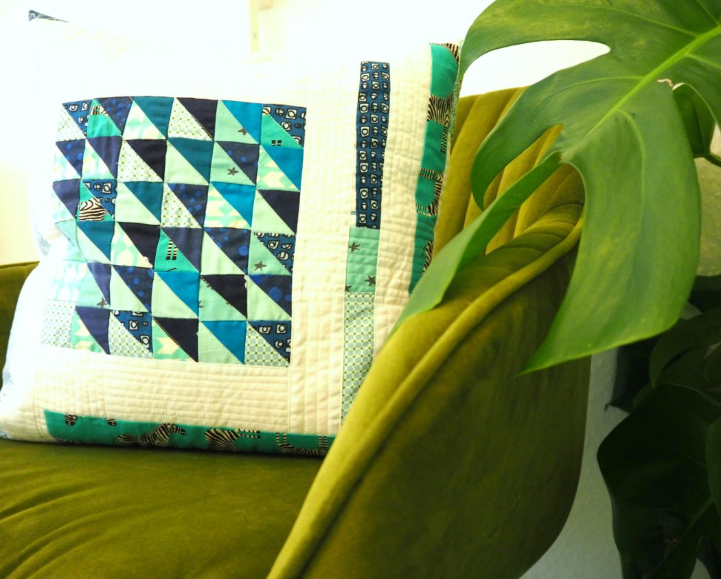
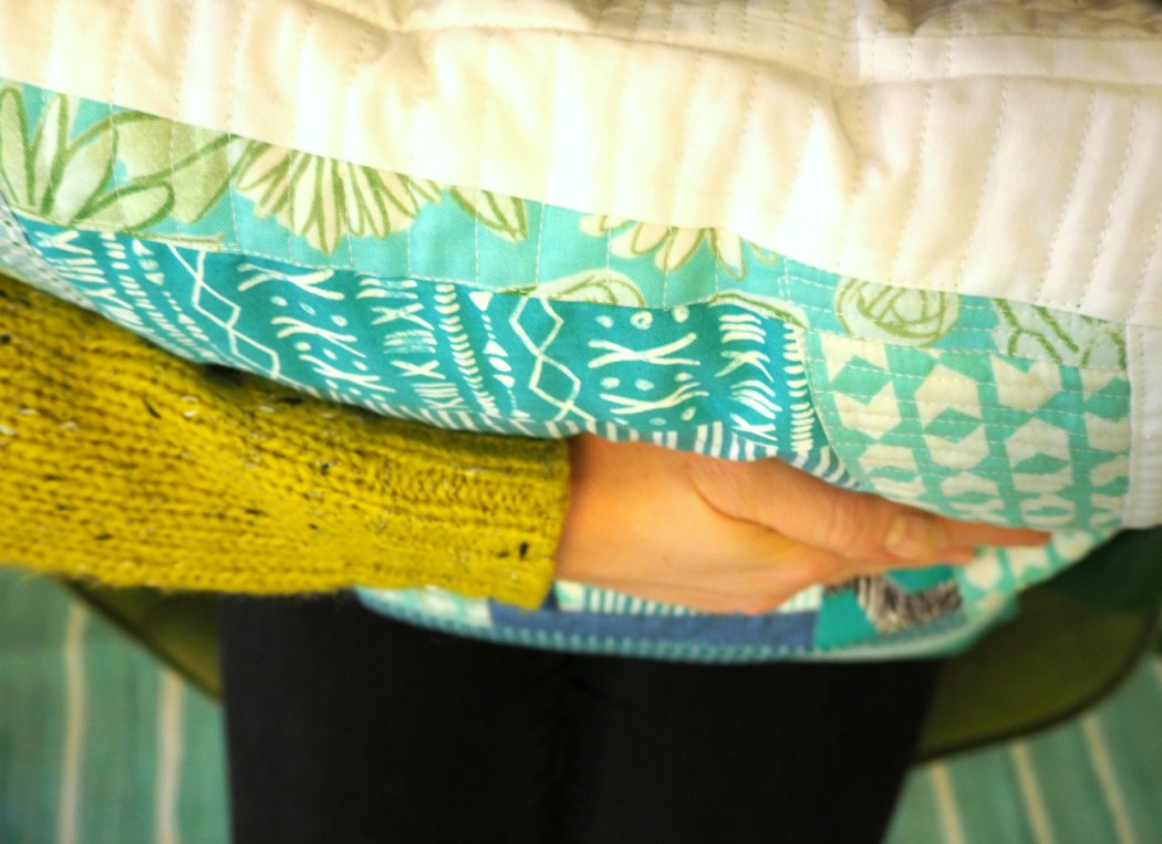
I love Pantone’s Color of the Year: Greenery! Over the past year or so I have been growing the green section of my fabric stash. It started with the commissioned green ombre quilt for my friend – I had very little green fabric at that point, I had to fill a void. There have also happened to be a lot of juicy greens featured in fabric collections lately, which made shopping for it a super easy ‘task’; I suppose for Pantone to pick Greenery as their Color of the Year 2017 is an accurate reflection of this trend.

Succulence Quilt | veni vidi vicky
Also remember when I set up my sewing space in what is basically greenery… I might have been on to something ;-)

Bryan House Quilts and No Hats in the House are hosting this year’s Pantone Quilt Challenge, so I decided to put my green stash to use and make a quilt for our home (this never happens!) and enter it.

Succulence Quilt | veni vidi vicky

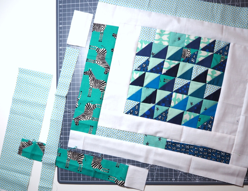
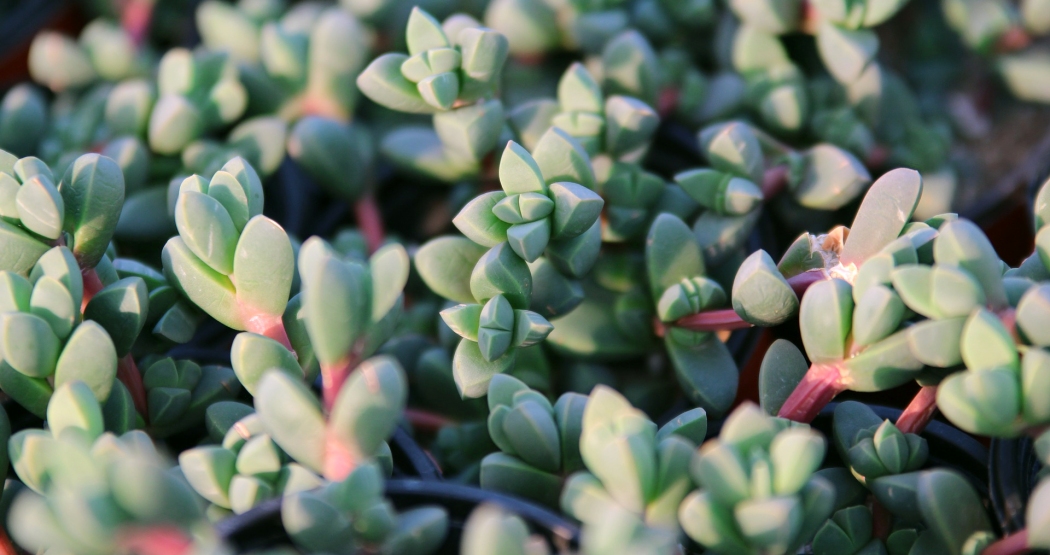
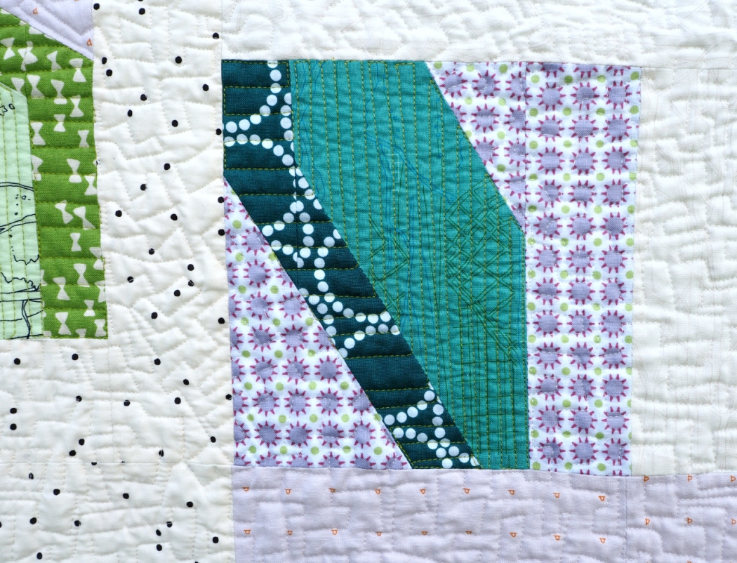
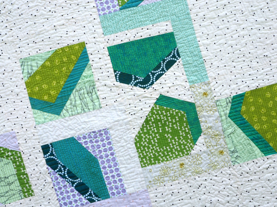
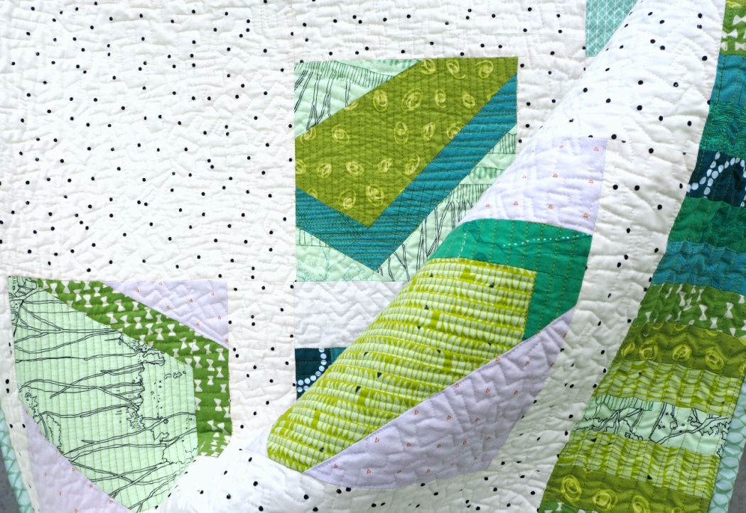
I drew my inspiration from chunky succulent leaves. I love geometric depth and dimension as a design feature and had long wanted to try it for a quilt. Our home is full of succulents because these are the only plants that stand a chance against my very not green thumb. Extra chunk for the win!

Succulence Quilt | veni vidi vicky

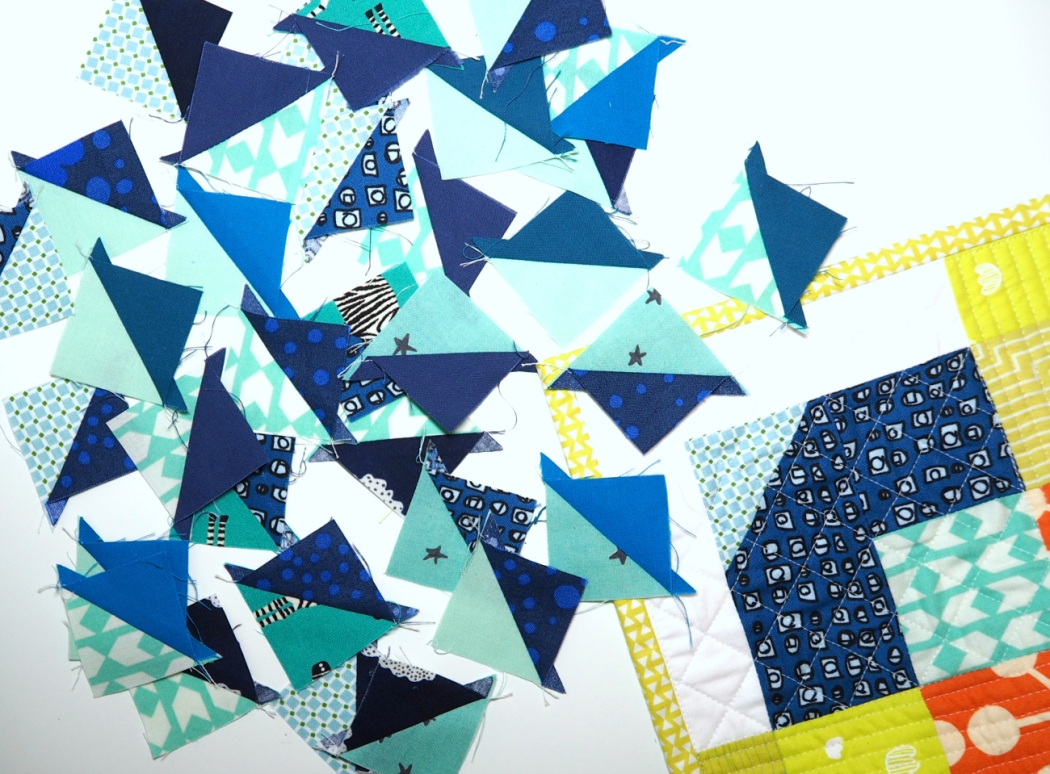
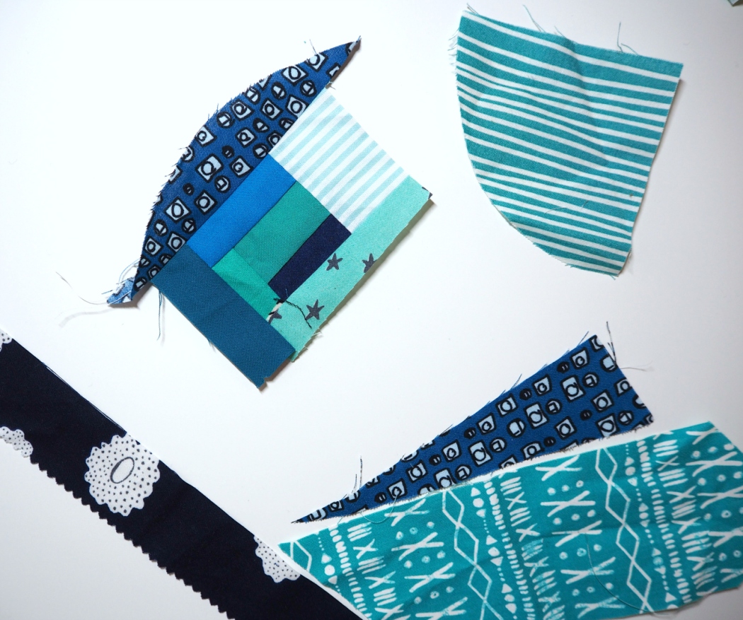
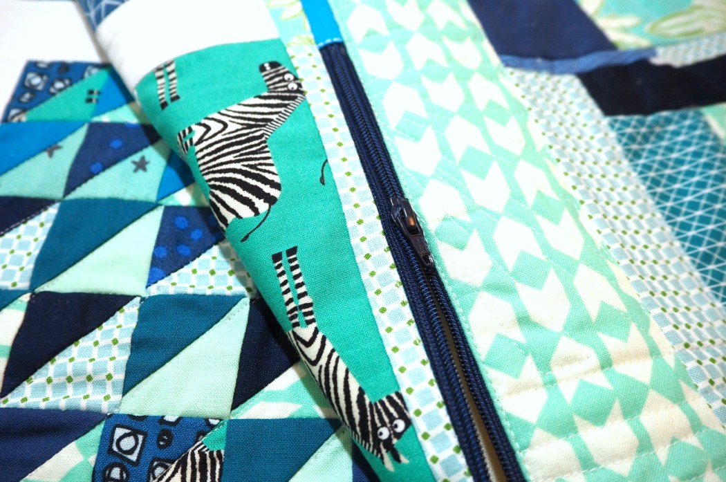
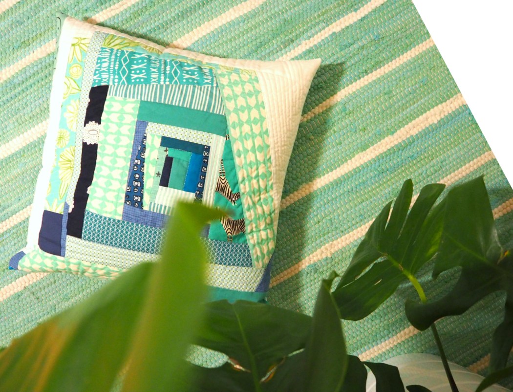
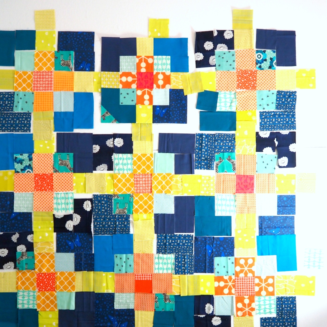
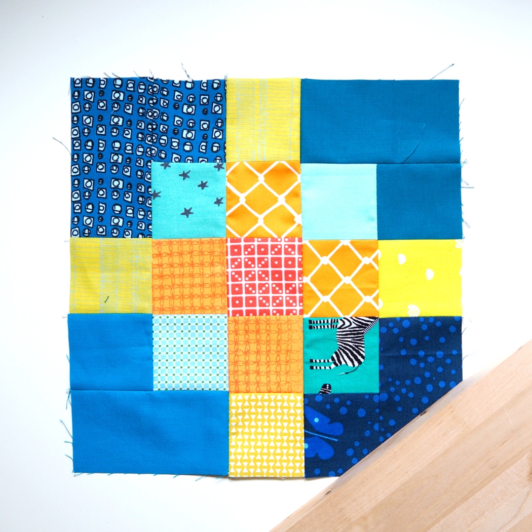
The color palette revolves around ‘Greenery’, naturally. I went from there and added darker teal-y greens and some lighter ones to soften the scheme. The design is set on a low volume background (Going Home to Roost’s ‘Hello, Bear’ collection), letting the leaves arrange into a light-aired constellation. I really wanted to incorporate some lilacs to create a colorful succulent palette.

Succulence Quilt | veni vidi vicky

As the depth effect plays on light and shade, I wanted to put another spin at the shading effect and added the ombre border, which also reminds me of a Pantone color card – full circle kind of moment.

Succulence Quilt | veni vidi vicky

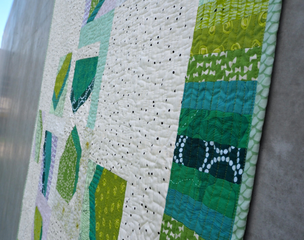
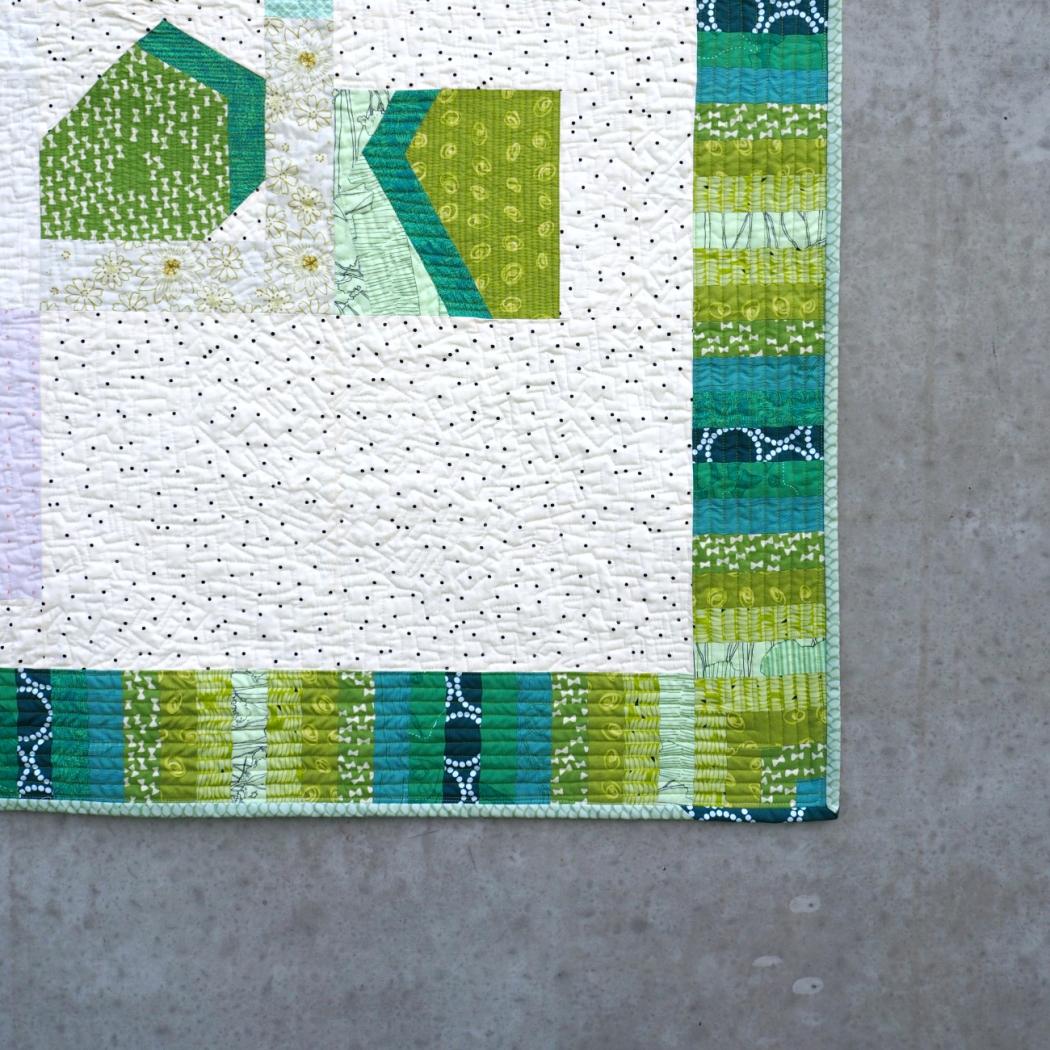
With the quilting I wanted to accent the 3D effect. So I used straight lines in various densities within the leaves. The background got an all over texture of ‘geometric stippling’ (not sure whether this pattern has an official name).

Succulence Quilt | veni vidi vicky

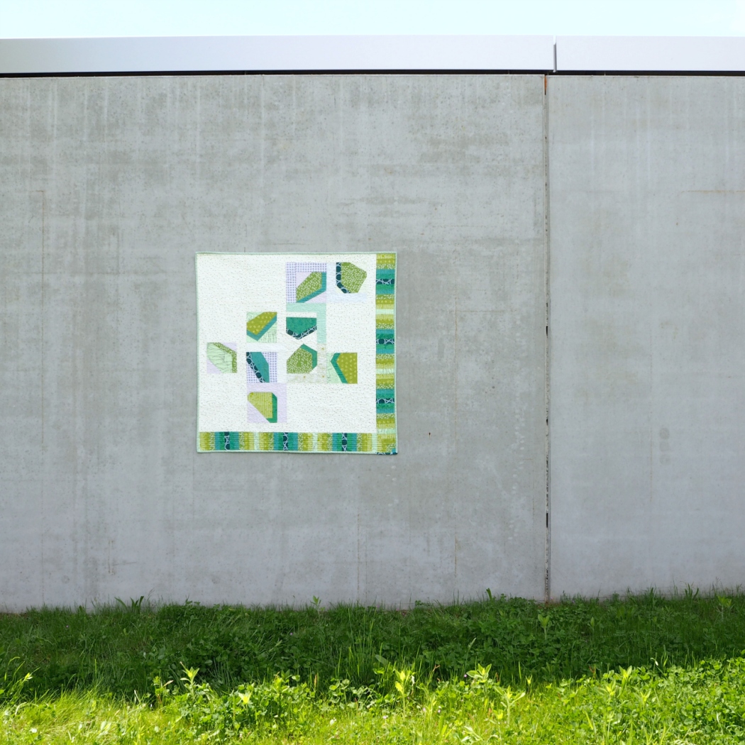
We recently updated our tiny kitchen and this quilt will go on the wall above our breakfast table. I’m really happy I get to keep this one!

Succulence Quilt | veni vidi vicky

You can have your say in The Pantone Quilt Challenge and vote for your fav quilt entered, including my Succulence Quilt in the Big Quilt category! Hop on over HERE to do so starting May 29th!

vicky_lang

The blog post 'Succulence Quilt' is linked up with Modern Patch Monday at Modern Cologne Quilters, Handmade Monday at Sum of their Stories and Handmade on Tuesday


Merken

Merken

When life gives you scraps…

OLYMPUS DIGITAL CAMERA
…you have to improvise a little.

My last baby quilt left me with a bunch of HST clippings in aqua and teal hues. The scraps were barely 1.5” square,  would I have trimmed them up before sewing with them I might have ended with a grid as small as 0.5”. Nope, that wasn’t a day for tiny piecing and I don’t need much convincing to skip trimming in general. I was going to wing it that day and just piece those HSTs in the shapes they came in – no discrimination, just improvising.

OLYMPUS DIGITAL CAMERA

OLYMPUS DIGITAL CAMERA

And as just sewing, not pressing, not trimming, not measuring, not squaring felt quite liberating I kept on adding borders to the HST panel and found some more coordinating scraps to make a separate improv log cabin piece. I quilted both of them up with multi directional straight line clusters and turned them into a pillow cover with my usual zipper finish.

OLYMPUS DIGITAL CAMERA

OLYMPUS DIGITAL CAMERA

I’m your textbook perfectionist and quilting offers a perfect gateway to those of us who are. I’ve been trying to be more conscious about little flaws and imperfections that happen and to embrace them as part of the quilt making process and a quilt’s character. When improvising there are no points to be matched or measurements to be followed. Putting all that off the plate makes improv piecing an almost cathartic experience.

OLYMPUS DIGITAL CAMERA

OLYMPUS DIGITAL CAMERA

Also, for the first time in forever, this is a project that was not intended as a gift for anyone or served any other kind of purpose with a deadline to make. But it happens to work well with some new things in our home – this might be because I’ve been in a ‘colours of the sea’ phase ;-)

OLYMPUS DIGITAL CAMERA

OLYMPUS DIGITAL CAMERA

OLYMPUS DIGITAL CAMERA

You can expect more improv content on veni vidi vicky next year, since I just joined a quilting bee focusing on this very technique. Talk to you soon and let’s raise a glass to all those missed points!

vicky_lang

Merken

Merken

Merken

Golden Net baby quilt

Golden Net baby quilt | veni vidi vickyNeed a little colour therapy on this November day? Grab a pot of coffee and let me show you this happy quilt I just finished!

I’ve talked about the challenge to make quilts for boys on here before. Whereas I’m not an advocate for gendered toys, clothes or stereotypes in general, I definitely feel like there are a lot of fabric lines that appear rather feminine. I personally feel drawn to bolder coloured lines in general, so I’m not even talking about shades of pinks, but rather motifs which seem to include a lot of florals and whimsical designs lately. This isn’t that obvious until you’re actively trying to avoid them for a project.

Golden Net baby quilt | veni vidi vicky

So when I think up a baby boy quilt I work around a colour palette instead of a line or a designer. My initial idea for this quilt was a navy night sky lit with bright yellow stars; a plan I didn’t stick to as the design evolved (read more about the process here).

Golden Net baby quilt | veni vidi vicky

The quilt does involve the yellows and the dark blues as well as a collection of mint and orange to red coloured squares. I really like that it feels like a modern Twist on the four Primary colours, without being completely predictable.

Golden Net baby quilt | veni vidi vicky

Golden Net baby quilt | veni vidi vicky

But stars are no more! In an unexptected twist rays of starlight interwove into a golden net spun across the surface of the quilt. Magic!

GOLDEN NET BABY QUILT
finished size:
40×40″
pattern: my own, dubbed ‘Golden Net’
quilting design: straight lines, including crosshedge
fabric used: scrappy! includes Heather Givans, Lizzy House, Cotton + Steel, Katy Jones, Elizabeth Hartmann, Karen Lewis…
backing fabric: Backyard Roses by Nadra Ridgeway
binding: blank selvage fabric

Golden Net baby quilt | veni vidi vicky

Entrance Lupa! (You didn’t see that one coming, eh? ;-) ) Last weekend graced us with a day sans rain and word’s out the sun even made a short appearance. So I grabbed my crew to go out and take these photos. I hadn’t washed the quilt at that point, so I wasn’t too worried about it getting a little dirty. Let it be said though, I’m now reminded why I don’t usually set my designs on white background.

Okay, wherever you are, I hope weather’s actually nice there. If it is, let me now, so I can plan my move to your place. Until then I’ll sunbathe under my sewing light, stay quilty!

vicky_lang

This post is linked up with Modern Patch Monday at Modern Cologne Quilters and Handmade Monday at Sum of their Stories

Merken

Merken

A literal Work in Progress [WIP]

This one started with me wanting to make a plus quilt and ended up somewhere pretty different.

When I design a quilt, I almost always start with the overall layout and composition. Once I have that figured out I will break the design down into smaller pieces. This way my quilts are rarely made up of repeating blocks. So how this baby quilt came about is pretty untraditional by my standards, but traditional in the common quilting sense.

OLYMPUS DIGITAL CAMERA

My starting point was the idea of a yellow plus with a orangey center, almost like an abstract star. These stars were to be set on a dark blue background. I lengthened the plus/star by a square on each end, so it would blend from yellow into a deeper red fabric in the center. When the dark blue hues came out really strong and the contrast felt too stark, I added in a group of mints to blend between the light warm hues and the dark background.

A literal Work in Progress | veni vidi vicky

At that stage I began cutting for my blocks. Pinned to the design wall I found the navy fabrics to be too loud still. Put next to each other the corners of 4 meeting blocks formed a really background heavy formation that took the focus away from the light block centers. This wasn’t going to work, the blocks needed to be separated by a white sashing (something I usually try to avoid, as it seems so old-fashioned to me personally).

A literal Work in Progress | veni vidi vicky

By breaking up the sashing with one yellow square in the middle of each side of the block I webbed the yellow strings back together, creating the look of a net spanned across the surface. This effect inspired the name of ‘Golden Net’, a little cheesy, but I settled ;-)

A literal Work in Progress | veni vidi vicky

I’m almost finished with this baby quilt now and will be back with pictures.
Have a good week everyone!

vicky_lang

This post is linked to Modern Patch Monday at Modern Cologne Quilters, Fabric Tuesday at Quilt Story, Sew Cute Tuesday at Young Texan Mama, Let's Bee Social at Sew Fresh Quilts, TGIFF this week at The Quilt Journal, Finish it Up Friday at Crazy Mom Quilts and Fabric Frenzy Friday at Fort Worth Fabric Studio.

Merken

Merken